Facebook cuts off the edges of my thumbnail images!
Posted on Aug 4, 2011 in Social Media | 0 comments
If you look at your Facebook fan page, odds are you’ll see five photos—the five that you most recently added or that your fan page was most recently tagged in—in a photo strip across the top of the page. The image, above, of Oreo’s use of the photo strip is from the excellent article 35 Creative Facebook Fan Page Photo Strips. There are, as you might guess, 34 other great examples there of how brands are making use of those images.
Most fan pages are not effectively using this, however. Honestly, it can be a bit tricky.
First, your photo strip thumbnails are in random order. On a personal profile you have some control over the order of the thumbnails. On a fan page, every time the page loads the order is randomly determined. This means images have to be used that can be placed in any order–such as each image representing a different word, concept or product. Note that if you look at the examples the thumbnails have a consistent theme. They mesh well with each other and with the profile image.
Your photo strip thumbnails are the five most recent images you have uploaded. Although I’ve read that photos your fan page is tagged in appear in the photo strip as well, I have not observed this behavior. Instead of constantly needing to delete and re-add your five special photos whenever you add a new photo, you can remove unwanted photos from the photo strip. Simply hover over the photo and click the “x” button. It’s not as nice as being able to fix a setting to always keep the same five up there no matter what, but at least you can manage with only minimal disruption.
Now for the biggest nuisance of them all: thumbnail size. Photo strip thumbnails are 97px wide by 68px tall. Note they are significantly wider than they are all, which is a real nuisance if you want to show a face or a book or anything else with a more vertical orientation.
A logical person would think “big deal. I’ll just change the shape of my image to that ratio, filling in the background as necessary.” You could set the image to sizes such as:
- 97 x 68 (no shrinking required)
- 194 x 136 (double size)
- 970 x 680 (ten times the size of the thumbnail)
Unfortunately, for reasons of their own, Facebook doesn’t do a simple scaling, cropping as necessary to get the right shape. Instead, they crop a little off the sides, more off the top, and much more off the bottom. This arbitrary shape makes life difficult, as now anyone who wants to display a photo thumbnail there needs to get exactly the right amount of unused padding on each side of the image.
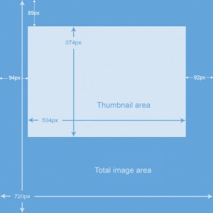
Here’s an example of how Facebook crops a square 720×720 image:
The image is from a tutorial on effectively using the Facebook photo strip for advertisements. If you’re using GIMP as your image editor, you can do this with the image:
- Use Tools > Transform > Scale to make the image (that is not padded) 374px high, making sure the chain icon is whole so the other dimension is correspondingly shrunk.
- Use Image > Canvas Size to make the image 534px wide, making sure the chain icon is broken so the height is unchanged. Click the “center” button and resize layers before clicking “ok”
- If necessary, fill in the background with a solid color or gradient or whatever is necessary to make the thumbnail look good
- Use Image > Canvas Size again, making the image 720px tall and 720px wide. Set the offset for X to 94px and the offset for Y to 89px
- Click the bucket tool and fill in the background with white, or whatever else you like—this part should only show when users click through to see the full-sized image, and not in the thumbnail. Some people add a thin white border around the thumbnail area (to allow for when it isn’t pixel perfect?) and then make the rest of the padding black, to blend in with the background Facebook shows when displaying individual images.
Then upload your five photos to Facebook and your thumbnail images should look good… but there’s one more step you may want to take. Comment on each photo with a description and a link if it is appropriate. If your five images feature five of your latest products, for example, then post a description on each photo saying “Our Widgetmeister 6000 has twice as many doodads as the Widgetmeister 3000. See the full product detail at http://mysite.com/widgetmeister6000.” In case your fans do click through to the full image, you might as well let them know where they can learn more.
Bonus note: the idea of making your image tiny, or making it a strange size with ultra-specific levels of padding all around may be only slightly less appealing then letting Facebook just automatically make a thumbnail from your original image. You do have one more option. You can use a full image with no padding and make sure only the important part shows.
You can use the below file if you’re comfortable working with GIMP layers. Add your large image with the framing layer on top of it. Then you can easily see the outline of what the thumbnail shows, and edit the photo until it’s a 720×720 image with the important part in the thumbnail box.


